
Plotting Pitfalls in Kibana Maps
- Oct 5, 2019
- 2 min read
Updated: Apr 9, 2020
ElasticSearch and Kibana are great tools for visualizing large datasets and recent improvements to the mapping system within the 7.X version has made them powerful tools for analyzing large geospatial datasets. Unfortunately, the current mapping capabilities suffer from various plotting pitfalls that can hinder proper analysis of the data. Consider storing the NYC taxi dataset in ElasticSearch and visualizing it with Kibana using either the heatmap, shaded grid, shaded circles, or document layer settings (as shown below).
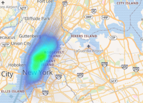
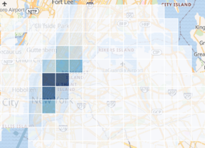
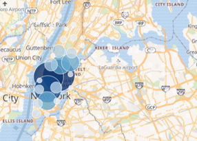
In each of these examples, the true distribution of the data is difficult to ascertain. For example, in the heat map view an analyst could easily make the false conclusion that taxi cabs never venture into the greater NYC area (i.e. Brooklyn). The shaded grid and shaded circles both are are a low-resolution and would require an analyst to zoom-in before being able to make accurate conclusions about where taxis are actually going.
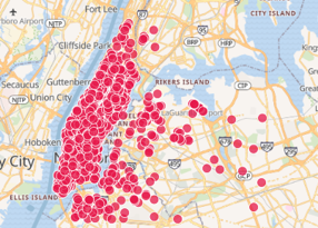
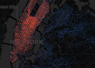
Depending on the version of Kibana you are using, the document layer might be limited to 2,048 points or 10,000 points (left and middle images respectively). Due to under-sampling neither of these display an accurate representation of the data. This is especially true in low-density areas where only a small number of points are displayed. The alternative is to display all the points (right image) using the Datashader framework. When all the points are displayed, not only are low density areas accurately represented but we can also see the details of individual streets in the high density area of Manhattan.


The problem is that getting all of the data out of ElasticSearch to make a detailed plot with Datashader can be slow. Simple queries for all the records are not efficient because ElasticSearch is optimized for aggregation. A better alternative is to use the geotile_grid aggregation to extract the data as a high precision aggregation. Unfortunately, there is one significant limitation to this approach. Aggregations in ElasticSearch are limited to returning at most 10,000 buckets (by default) so the resolution of the resulting query will be fundamentally limited. For example, if the area to be queried was 100km on each side then each grid bucket would be a 1km square, hardly enough to see detail as shown in the above plot.
Our solution is to divide the total query into multiple smaller queries each performed at a higher grid aggregation level (as shown below). Because each query is independent, they can be performed in parallel to reduce overall latency.


These individual queries are then combined into a single data frame and rendered with Datashader to produce a high resolution image of all the data points.

Learn more about how this was done by reading the Jupyter Notebook used to create these images or download the notebook code.

Comments